

Miracle
RESPONSIVE E-COMMERCE DESIGN FOR A SKINCARE BRAND
Overview
BACKGROUND
Miracle is a well-known skincare brand that has become a favorite in the skincare and beauty space for its continued promise of providing products with high quality ingredients at reasonable price points. With stores worldwide, they are now expanding beyond the storefront and branching out online. To compete in the digital marketplace Miracle is looking to modernize the overall look and feel of their brand.
CHALLENGE
With so many skincare brands on the market, Miracle Skincare wants to create a modern and fully responsive e-commerce website that provides users with a great shopping experience.
CLIENT
Miracle Skincare (Fictional)
ROLES
UX Designer, UX Researcher,
UI Designer
DURATION
2021 (140 hours throughout 6 weeks)
TOOLS
Figma, Adobe Illustrator, Miro, Maze, Optimal Workshop
PROBLEM
How might we create a fully responsive website that offers users
a smooth shopping and checkout experience?
Design Process


.png)


Research
01
RESEARCH GOALS
Before delving into research, I had the following goals in mind:
-
Update the overall brand identity to have a modern look and feel.
-
Identify the target audience and key demographics.
-
Learn about user needs, expectations, motivations, and pain points when shopping online.
-
Create a sleek and well-designed responsive website.
RESEARCH METHODS
To kick off the research phase, I chose to do the following research methods:

Secondary Research
Research the skincare industry by looking into various resources, such as reviews, articles, blogs, and videos.

Competitive Analysis
Conduct an analysis of competitors to gain a better understanding of the strengths and weaknesses in the skincare industry.

1-on-1 User Interviews
Speak with users to learn about their experiences, goals, needs, frustrations, motivations when shopping for skincare online.
SECONDARY RESEARCH & COMPETITIVE ANALYSIS
With these research methods in mind, I looked into skincare brands that felt similar to Miracle to get a better understanding of the current market. The secondary research then acted as an aid when conducting the competitive analysis.

USER INTERVIEWS (1-ON-1)
For the next portion of the research process I interviewed seven (7) participants all ranging from the ages of 21 to 43. Each session was recorded for later transcribing. During the interviews, I gathered the following information and data:
-
Most participants prefer shopping online.
-
Most participants shop with a specific item in mind.
-
Various participants shop once a month to semi-annually.
-
Various participants shopped within the last week to a few months ago.
-
All participants prefer using a computer versus a phone.
GETTING TO KNOW THE USER
Based on a mix of my research methods I created the persona, Julia. Throughout the entire design process I would refer back to Julia and ask the "What? Why? How?" questions to get a better understanding of perspective users.


Define
02
SETTING THE GOALS
With the findings from research I then moved on to defining the business goals, user goals, and technical considerations. By creating this diagram I was able to see overlapping commonalities.

CARD SORTING
With the project goals and technical considerations in mind, an open card sorting exercise was conducted with the use of Optimal Workshop. Nine (9) participants were provided with twenty (20) skincare products and asked to group them into categories. Based on those groupings, the participants labeled them with names they deemed fitting. The card sort revealed the following:
-
Categories were created based on product type and skin concern.
-
The most common categories created were Cleanser, Moisturizer, Eye Cream, Toner, and Serum.
-
Three (3) participants created Acne and Anti-Aging categories.
-
Three (3) participants created a Miscellaneous category.
FEATURE ROADMAP
Before listing out certain features, I reviewed my research to determine the high priority features down to the lowest priority features. These features were listed accordingly in the following order:
1. Must-Haves
2. Nice To Have
3. Surprising and Delightful
4. Can Come Later
MAPPING OUT EVERYTHING
Referring back to my research findings (card sorting, feature roadmap, and competitor analysis) I was able to generate a site map. By creating this structure that contained familiar patterns (homepage, search bar, navigation, and footer) could allow for a smooth and seamless experience.

Ideate
03
STARTING THE FLOW
By creating this task flow I was able to list out all of the pages and actions necessary when going through a browsing and checkout process.

GOING WITH THE FLOW
With this user flow, I was able to define possible scenarios users would take. Having several scenarios allowed for exploration of different actions, decisions, and pages.

Click the image below to view a larger version of this user flow.
SKETCHING IT OUT
By taking all of the research driven data, I drew out several low fidelity sketches to determine the placements of certain links, images, CTAs, etc. With each version I explored different layouts and content to see what I could come up with.


Design
04
LAYING DOWN THE FRAMEWORK
When it came to creating these mid-fidelity wireframes, I referred back to my low-fidelity sketches and site map as guides to determine layout choices and feature placements.

RESPONSIVE WIREFRAMES
Additionally I created responsive mid-fidelity wireframes to explore how various pages would respond and translate on different devices (desktop, tablet, mobile).

DISCOVERING THEIR BRAND IDENTITY
With the basework of the website created, I then focused on developing the overall brand identity to give off a more modern and elegant feel. As a form of inspiration I gathered imagery on Pinterest as a starting point.

Once an elegant and modern feel was established, I wanted it to be conveyed through its logo as well. As a way of continuing with the theme I landed on this crystal ball design.
PREPPING THE UI KIT
When creating the brand style tile and UI kit I drew inspiration and compiled assets from the moodboard, logo designs, and wireframes. To keep inline with the established attributes I then designed UI elements that could be used throughout the website.
.png)
RESPONSIVE DESIGNS
With the use of my responsive wireframes I was then able to create the responsive UI designs that would then be used during the prototyping phase.

Test
05
PROTOTYPE & USABILITY TEST
To test the website prototype, I recruited a total of seventeen (17) participants:
-
Four (4) participants took a moderated usability test via Zoom. The sessions were recorded and screenshared.
-
Thirteen (13) participants completed a usability test via Maze with prototype link. Results from the test were automatically compiled on Maze.
All of the participants completed the following tasks:
-
Look for Product
-
Add Product to Shopping Bag
-
Add Additional Product to Shopping Bag
-
Go Through Checkout Process

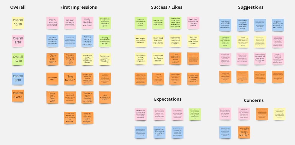
AFFINITY MAP
When creating this affinity map I took the findings from my Zoom and Maze sessions and grouped them into various sections. With this feedback I was able to see which areas needed to be addressed and adjusted based on high priority and low priority.
Next Steps
06
REVISIONS
With the feedback I received during the first usability test I would then make changes accordingly.
ADDITIONAL TESTING
Once those revisions have been I made, I would run a second round of usability testing with the updated prototype.
HIGH-FIDELITY DESIGNS & PROTOTYPE
With the help of additional testing making the final revisions for the high-fidelity designs and prototype would be reviewed with the stakeholders.
FINAL TEST BEFORE HANDOFF
Once I receive the approval from the stakeholders I would then handoff the design to the development team using Figma and Zeplin.
Reflection
07
STRUGGLES & OPPORTUNITIES
As my first dive into a UX project, this was a project of many firsts. With every aspect of the project being new, I definitely had my share of challenging moments. From getting acquainted with the entire design process to managing my time efficiently. While these were some struggles nonetheless, I welcomed them wholeheartedly in an effort to learn.
DECISIONS
I made strategic decisions to ensure each part of the design process could be utilized to its full potential. Throughout the project I realized the importance of research and the amount of thought that goes into creating such a product.
TAKEAWAYS
Given everything I learned while working on this project I hope to apply my experiences and techniques to all future projects.