


Crunchyroll
ADDING A STORE FEATURE TO THE CRUNCHYROLL APP
Overview
BACKGROUND
Crunchyroll was founded in 2006 and serves as one of the largest distributors and streaming services for anime and manga. Crunchyroll connects fans across 200+ countries and territories through the content they love. To date they have over 100 million registered users worldwide with 4 million of those registered users being paid subscribers. Crunchyroll also provides experiences to deepen fan engagement and community through social, events, games, consumer products, content distribution, content creation, and manga publishing
CHALLENGE
CLIENT
Crunchyroll (Hypothetical)
ROLES
UX Designer, UX Researcher,
UI Designer
DURATION
2021 (80 hours throughout 4 weeks)
TOOLS
Figma, Miro, Whimsical, Maze, Notion, Google Forms
With the company’s continued success and rapid growth, they are looking to add a store feature so users can shop on the app without needing to access the website. By adding this feature, they would like to make the overall user experience easier and hope to keep current users engaged while inviting new users to sign up.
PROBLEM
How might we create a new store feature that will allow for company growth, increase sales, and keep current users engaged while attracting new users to sign up?
Design Process


.png)


Research
01
RESEARCH GOALS
Before delving into research, I had the following goals in mind:
-
Design a store feature that integrates well with the current mobile app.
-
Analyze competitors to identify common trends and get a better understanding of the market.
-
Understand the target audience and identify goals, motivations, needs, and pain points.
-
Promote the app’s new store feature on the responsive website pages.
RESEARCH METHODS
To kick off the research phase, I chose to do the following research methods:

Competitive Analysis
Conduct an analysis of direct and in-direct competitors to gain a better understanding of the anime merchandise market.

User Interviews (1-on-1)
Speak with users to learn about their experiences, goals, needs, frustrations, motivations when shopping for anime merchandise.

.png)
Contextual Inquiry
User Survey
Have users explore the current Crunchyroll Store website to observe and hear about their browsing and shopping habits.
Generate a survey to gather data and learn about users' preferences related to Crunchyroll and purchasing items online.
COMPETITIVE ANALYSIS
With Crunchyroll being a well-known streaming service, there were several direct competitors that came to—Funimation, VIz Media, Netflix, Hulu, etc. But none of which had an existing feature on their apps. I then decided to delve further into in-direct competitors that are solely for shopping or offered some form of shopping.

PROVISIONAL PERSONAS
To get a better understanding of potential users I created the following provisional personas. Delving into this process early on in the research will help when creating the finalized user persona(s) down the line.


.png)


USER INTERVIEWS (1-ON-1), CONTEXTUAL INQUIRY & USER SURVEY
I originally had the intention of just conducting 1-on-1 user interviews, but thought it would be beneficial to create both a user survey and conduct some contextual inquiry as additional aids to the interviews.
.png)
.png)
Interviewed three (3) participants all ranging from the ages of 26 to 31. Each session was recorded for later transcribing. I also had users share their screen so I could observe their shopping habits when browsing the Crunchyroll Store website.
I utilized Google Forms to create a survey related to Crunchyroll Store website. Based on the responses I received responses from fourteen (14) participants all ranging from the ages of 13 to 40.
Based on my research, I gathered the following information and data:
-
Most participants found out about Crunchyroll through friends, family, and colleagues.
-
Most participants look for the following when shopping: clear photos, descriptions, reviews, and sizing options.
-
Most participants shop for anime merchandise every few months.
-
Various participants access Crunchyroll via their phone.
-
Various participants shop on other websites: AmiAmi.com, Amazon, Etsy, Hot Topic, and Box Lunch.
-
Some participants have purchased products from the Crunchyroll Store website.

Define
02
GETTING TO KNOW THE USER
Based on a mix of my research methods I created the persona, Joshua. Throughout the entire design process I would refer back to Joshua and ask the "What? Why? How?" questions to get a better understanding of perspective users.

Click the image below to view a larger version of this user persona.
POV STATEMENTS & HMW QUESTIONS
To further explore my persona, I came up with several "point of view" statements which led to "how might we" questions that could provide possible solutions.

SETTING THE GOALS
Based on my research findings I then came up with the following business goals, user goals, and technical considerations to identify any overlapping commonalities.

MAPPING OUT EVERYTHING
I generated this site map based on the current tabs found on the app and my research findings. With the help of the Key Guide, you will notice the new Store feature, new tabs, and the relocated Home tab are listed with red text. Before landing on this final site map, I went through several iterations based on feedback I received.


Ideate
03
GOING WITH THE FLOW
With this user flow, I was able to define possible scenarios users would take. Having several scenarios allowed for exploration of different actions, decisions, and pages.

Click the image below to view a larger version of this user flow.
ADDING NEW STORE FEATURE & RELOCATING SIMULCAST FEATURE
In order to incorporate the new Store feature into the existing Crunchyroll app I had to decide which current feature to relocate. Based on my research relocating the Simulcast feature under the Browse section made the most sense as the section was closely related to browsing.

SKETCHING IT OUT
By taking all of the research driven data, I drew several low-fidelity sketches to determine the placements of the top navigation bar, images, CTAs, etc. The first image showcases early exploration, while the second image showcases the more refined layout.


Design
04
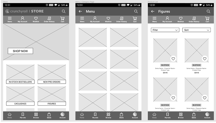
LAYING DOWN THE FRAMEWORK
When it came to creating these mid-fidelity wireframes, I referred back to my low-fidelity sketches and site map as guides to determine layout choices and feature placements.


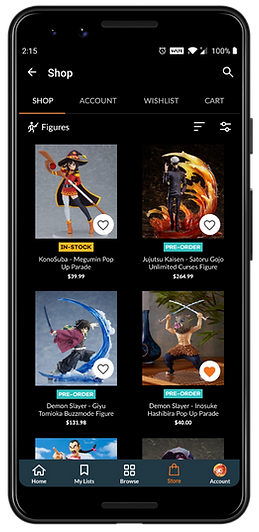
DESIGNING THE USER INTERFACE
After revisiting my mid-fidelity wireframes and the current Crunchyroll app I ended up redesigning the top navigation bar. Since this new Store feature is an addition, I opted for a similar and familiar design that already exists on the Crunchyroll app. The assumption is that it would provide users with a more seamless experience.
.png)
Click the images below to view a larger version of the UI designs.
.png)
PREPPING THE UI KIT
When creating the brand style tile and UI kit I drew inspiration and compiled assets from the moodboard, logo designs, and wireframes. To keep inline with the established attributes I then designed UI elements that could be used throughout the website.

Click the image below to view a larger version of this UI kit.
Test
05
PROTOTYPE & USABILITY TEST
To test the website prototype, I recruited a total of eleven (11) participants:
-
Three (3) participants took a moderated usability test. Two (2) via Zoom and one (1) in-person. The sessions were recorded and screenshared.
-
Eight (8) participants completed a usability test via Maze. Results from the test were automatically compiled on Maze.
USABILITY TEST FINDINGS

Pain Points
-
Some users expected a cart icon next to the Cart tab.
-
Several users had a hard time locating the Filter section.
-
Some users wanted to see more filter options under the Filter menu.

Successes
-
Majority of the users were able to locate the new Store feature with ease.
-
Several users found the Categories section helpful.
-
Most users stated that the new Store feature was easy to navigate, thus making it user friendly.
-
Several users liked how organized everything was.
HEAT MAPS
With the help of Maze, I was able to gather heat maps from the eight (8) participants who completed the unmoderated usability test. Each heat map was able to record the paths the participants took.
The participants completed the following tasks:
Locate New Store Feature & Explore Categories
.jpg)
.jpg)
.jpg)
Add Item to Wishlist
.jpg)
.jpg)
.jpg)
Use Filters to Find Specific Items
.jpg)
.jpg)
.jpg)
.jpg)
Add Item to Shopping Cart
.jpg)
.jpg)
.jpg)
Next Steps
06
PRIORITY REVISIONS
With the feedback I received during the first usability test I would then make changes to pain point areas by adding:
-
A cart icon next to the Cart tab.
-
Add labels to the Filter and Sort By sections.
-
Add more filter options under the Filter menu.
ADDITIONAL TESTING
Once those priority revisions have been I made, I would run a second round of usability testing with the updated prototype.
HANDOFF TO DEVELOPMENT
Once I receive the approval from the stakeholders I would then handoff the design to the development team via Figma.
Reflection
07
STRUGGLES
Staying within certain design constraints and adapting to an existing design system proved to be a challenge. This became apparent when looking for certain assets (icons, fonts, etc.). I initially searched and scoured the internet for any existing style guides, but with no luck. This led me to having to find near perfect matches for certain typefaces and icons.
IMPROVEMENTS
With so many users commenting on the filter options there is room to expand on the filter options section and add all the features/functions the users mentioned during both user interviews and usability testing.
OPPORTUNITIES
While there were some struggles that came with working with an existing design system, having existing assets (logos, imagery, etc.) did make the project easier to complete and take on. With other projects, stakeholders normally request establishing a brand identity as part of the design process, but having an already well-established brand identity allowed me to focus on researching and perfecting the new store feature.

DECISIONS
Relocating existing navigation tabs proved to be a daunting process as it took multiple iterations before landing on a final layout that wouldn't take away from the app.