
CyberSpace
RESPONSIVE WEBSITE FOR A VIRTUAL REALITY ARCADE
Overview
BACKGROUND
CyberSpace is a new virtual reality arcade that offers a wide variety of fully immersive games and experiences. The idea behind CyberSpace first immerged when a group of friends' love for virtual reality games became limited when just playing at home. CyberSpace brings the immersive multiplayer experience to reality. Players not only get to see the world around them with VR headsets, but feel their surroundings thanks to the haptic vests and the large spaces carefully designed to fully transport you to a different world. Gamers and non-gamers alike can enjoy a wide variety of games and experiences.
CLIENT
CyberSpace (Fictional)
ROLES
UX Designer, UX Researcher,
UI Designer
DURATION
2021 (80 hours throughout 4 weeks)
TOOLS
Figma, Adobe Illustrator, Maze, Whimsical, Notion
CHALLENGE
Create a modern and fully responsive website that represents their brand, showcases their experiences, pricing, and the ability for users to book reservations online.
PROBLEM
With this challenge in mind, how might we create a website that helps promote their brand and the experiences they offer?
Design Process


.png)


Research
01
RESEARCH GOALS
Before delving into research, I had the following goals in mind:
-
Update the overall brand identity to have a modern look and feel.
-
Identify the target audience and key demographics.
-
Learn about user needs, expectations, motivations, and pain points when shopping online.
-
Create a sleek and well-designed responsive website.
RESEARCH METHODS
To kick off the research phase, I chose to do the following research methods:

Secondary Research
Research the immersive entertainment industry by looking into various resources, such as reviews, blogs, and videos.

Competitive Analysis
Conduct an analysis of competitors to gain a better understanding of the strengths and weaknesses in immersive entertainment.

1-on-1 User Interviews
Speak with users to learn about their experiences, goals, needs, frustrations, motivations when booking immersive experiences.
SECONDARY RESEARCH & COMPETITIVE ANALYSIS
With these research methods in mind, I looked into other immersive entertainment companies that felt similar to CyberSpace to get a better understanding of the current market.


PROVISIONAL PERSONAS
To get a better understanding of potential users I created the following provisional personas. Delving into this process early on in the research will help when creating the finalized user persona(s) down the line.


.png)


USER INTERVIEWS (1-ON-1)
For the next portion of the research process I interviewed seven (7) participants all ranging from the ages of 25 to 32. Each session was recorded for later transcribing. During the interviews, I gathered the following information and data:
-
All participants spend time with their family and friends often.
-
All participants have partook in some form of location-based entertainment (VR games, escape rooms, arcades).
-
Most participants own a VR headset.
-
Most participants enjoy immersive experiences.
-
Most participants learned or heard about these experiences through friends.
-
Some participants learned or heard about these experiences through social media.
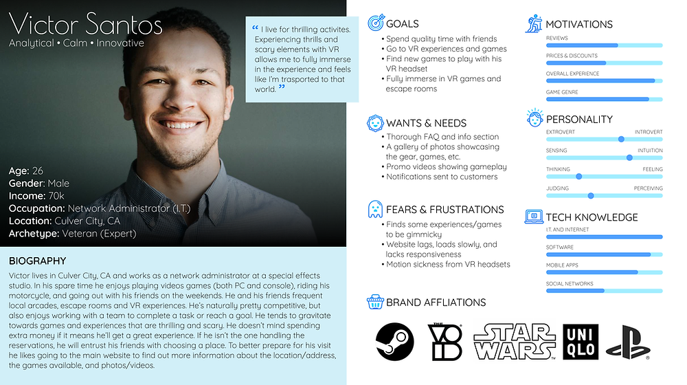
GETTING TO KNOW THE USERS
Based on my research I created two (2) personas, Victor and Sandra. With a variety of interviewees, I thought it would be beneficial to have two personas. Throughout the entire design process I would refer back to Victor and Sandra to ask the "What? Why? How?" questions for a better understanding of perspective users.


Define
02
SETTING THE GOALS
With the findings from my research I then moved on to defining the business goals, user goals, and technical considerations. By creating this diagram I was able to see overlapping commonalities.

FEATURE ROADMAP
Before listing out certain features, I reviewed my research to determine the high priority features down to the lowest priority features. These features were listed accordingly in the following order:
1. Must-Haves
2. Nice To Have
3. Surprising and Delightful
4. Can Come Later
MAPPING EVERYTHING OUT
Referring back to my research findings (card sorting, feature roadmap, and competitor analysis) I was able to generate a site map. By creating this structure that contained familiar patterns (homepage, search bar, navigation, and footer) could allow for a smooth and seamless experience.

Ideate
03
GOING WITH THE FLOW
With this user flow, I was able to define possible scenarios users would take. Having several scenarios allowed for exploration of different actions, decisions, and pages.
%20-%20Compr.png)
Click the image below to view a larger version of this user flow.
SKETCHING IT OUT
By taking all of the research driven data, I drew out several low-fidelity sketches to determine the placements of certain links, images, CTAs, etc. With each version I explored different layouts and content to see what I could come up with.


Test
04
LAYING DOWN THE FRAMEWORK
When it came to creating these mid-fidelity wireframes, I referred back to my low-fidelity sketches and site map as guides to determine layout choices and feature placements.

TESTING OUT THE PROTOTYPE
Before proceeding with the UI designs, I wanted to test out the layout and flow of the mid-fidelity wireframes to prevent having to go back and revise any UI designs. To test the website prototype, I recruited a total of twelve (12) participants.
-
Two (2) participants took a moderated usability test via Zoom. The sessions were recorded and screenshared.
-
Ten (10) participants partook in a group critique usability test via Zoom. During the group critique session participants voiced their thoughts and feedback while I took notes.

All of the participants completed the following tasks:
-
Explore the homepage.
-
Learn more about a VR game/experience.
-
Book a VR game/experience.
Design
05
DISCOVERING THEIR BRAND IDENTITY
With the basework of the website created, I then focused on developing the overall brand identity to give off a more futuristic and sleek feel. As a form of inspiration I gathered imagery on Pinterest as a starting point.


PREPPING THE UI KIT
When creating the brand style tile and UI kit I drew inspiration and compiled assets from the moodboard, logo designs, and wireframes. To keep inline with the established attributes I then designed UI elements that could be used throughout the website.


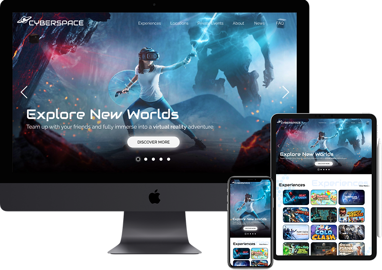
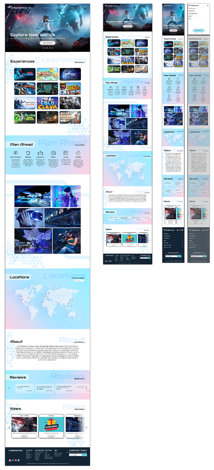
RESPONSIVE DESIGNS
With the use of my responsive wireframes I was then able to create the responsive UI designs that would then be used during the final prototyping phase.
Next Steps
06
REVISIONS
With the feedback I received during the first usability test I would then make changes accordingly.
ADDITIONAL TESTING
Once those revisions have been I made, I would run a second round of usability testing with the updated prototype.
HANDOFF TO DEVELOPMENT
Once I receive the approval from the stakeholders I would then handoff the design to the development team using Figma and Zeplin.
Reflection
07
DECISIONS & IMPROVEMENTS
Working on this project allowed me to explore and reap the benefits of creating multiple personas. Creating a responsive with not just one, but two personas allowed me to fill in any gaps and take their decisions into consideration. As I progressed, I ultimately made the decision to test out the mid-fidelity wireframes/prototype before moving on to the UI designs as I wanted to focus more on the functionality.
OPPORTUNITIES
By first tackling the functionality of the website with the help of usability testing, it allowed me to fully focus on the designs with no hesitation. Having this creative freedom with minimal setbacks allowed me to produce the high-fidelity designs and prototype in a timely manner.
STRUGGLES
Early on in the project, I did struggle with figuring out the brand identity. While I initially had a specific vision in mind, it did fall into an almost cliché cyberpunk theme that has already been done time and time again with other VR arcades/experiences. With this in mind, I was able to take the brand identity into a completely different direction, a design that was unexpected, lighter, and refreshing.